

The Halston Experience
Birchstone Residential is redefining the multifamily living experience with the Halston brand — unparalleled communities that are more than just a place to live; it’s a lifestyle where residents flourish. Defined by elegance and warmth, residents can expect visually appealing and functional spaces, superior customer service, and an inviting ambiance that brings people and families together.
As the connecting point of our culture and the cornerstone of our company, people come first — a genuine reflection in every one of our Halston communities and relationships with our residents. Halston is a brand that sparks a sense of luxury where quality is a way of life. We don’t just give residents keys, we give them dynamic experiences.
The Halston Mood
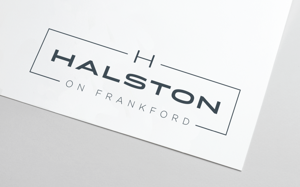
THE LOGO
As the core of the Halston brand identity, the logo embodies elegance and chicness with a light, airy design accented by a bold font choice. The primary logo combines the elements of the “H” mark, the boxed outline, and the name type featuring typography that feels open and welcoming — a symbol of superior customer service.
Halston represents a portfolio of communities, so having an established brand identity with enough flexibility to serve each unique community and location was important. The logo can be altered to include “on,” “at,” or “by” modifiers that are location-based and call to mind a city, neighborhood, street, landmark, or other notable area. The uniqueness of the modifier adds a personal, recognizable element while bridging the connection between the overarching identity and an individual property’s personality.
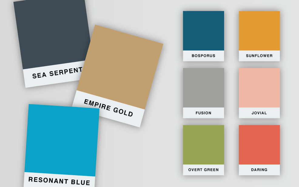
Color Palette
Halston’s color palette is grounded in three primary colors — a timeless midnight gray, classic beige, and aqua blue — all chosen to reflect the style, voice, and strong values of the overall brand. Three secondary and three tertiary colors help supplement the palette and allow individual properties to make the brand their own with a personal spin.
The selected colors are bright and inspired by nature elements, such as the vibrant green of a grassy park or the warm orange tones of a sunset. Incorporating the extended palette of secondary and tertiary colors allows individual Halston communities to match their interior and exterior finishes, creating a seamless experience for residents between the visual brand and the physical experience.
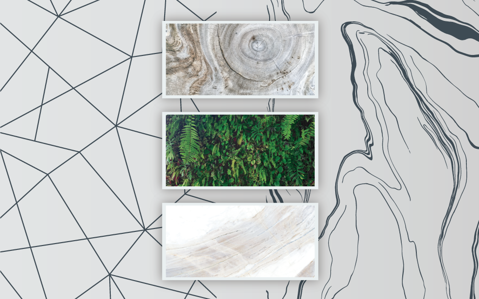
Pattern and Texture
In addition to the color palette, the Halston brand also is complemented by custom brand patterns and textures. While these elements are used sparingly so they don’t compete with the primary brand message, they serve as artistic additions that incorporate tangible features and fun visual features.
Three primary brand textures are used: white marble with gray veins, a soft neutral-beige driftwood, and a stunning deep foliage wall. These pair well with the interior design style and upscale features and amenities of the Halston brand while providing a sense of where modern meets timeless, classic aesthetic.
For that personal touch, communities can choose between two different brand patterns: a rounded, wavy visual inspired by water and topographic maps, or a more structured, geometric option. This approach allows for flexibility within the brand while still remaining true to Halston’s original roots.